Welcome to the fifth article in my series on the classical painting method known as the Flemish Method. Used by 16th and 17th century Flemish masters, this method allows artists to develop paintings through the following seven stages:
1. Drawing
2. Imprimatura
3. Umber Underpainting
4. Dead Layer
5. First Color Layer
6. Second Color Layer
7. Detail Layer
In my previous articles I have already covered drawing and imprimatura, the umber underpainting, the dead/grayscale layer, and the initial color layer, so today I’ll be demonstrating the second color layer.
Preparing to paint
Because this method involves glazing and layering, it’s important to allow the painting to dry thoroughly between layers (usually four weeks) and to properly condition the painting surface with linseed oil or walnut oil prior to painting.
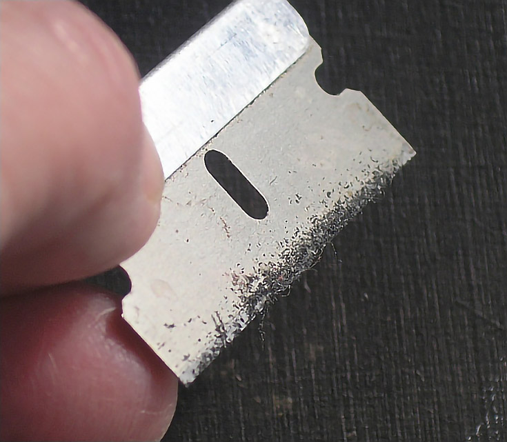
To determine if your painting is dry enough, scrape it very lightly with a razor blade (as shown below). If paint comes off as dust, it’s ready for the next layer of paint. If not, you’ll need to wait longer for the paint to dry completely.
Once you know the previous layer is dry (and immediately before you begin to add the next layer of paint) rub linseed or walnut oil over the painting with the palm of your hand and wipe off the excess. This will help the new paint bond to the layer below.
If your painting is quite large, you may not want to rub oil over the entire painting right away. In fact, even though my painting is quite small (6×8) I also decided to work section by section, preparing each area with a rubbing of Alkyd/Walnut Oil medium, then wiping off the excess before painting that specific area.
Adding the second layer of color to your painting
The purpose of the first color layer is to darken shadows and introduce color to the dead layer. The purpose of the second color layer is to build upon that foundation by bringing more color and more brightness to the painting.
If you’re following along with your own Flemish-style painting, you’ll probably notice that after finishing the initial color layer, the color glaze you added became more transparent after it dried (causing more of the dead layer to show through and dull the color). When you add your second color layer, you’ll be restoring those jewel-like tones by glazing the same colors again over each area.
And, as mentioned in previous articles, your color mixtures can be thinned with painting medium made up of 2 parts turpentine and one part Damar varnish (add a drop of lavender oil if you like).
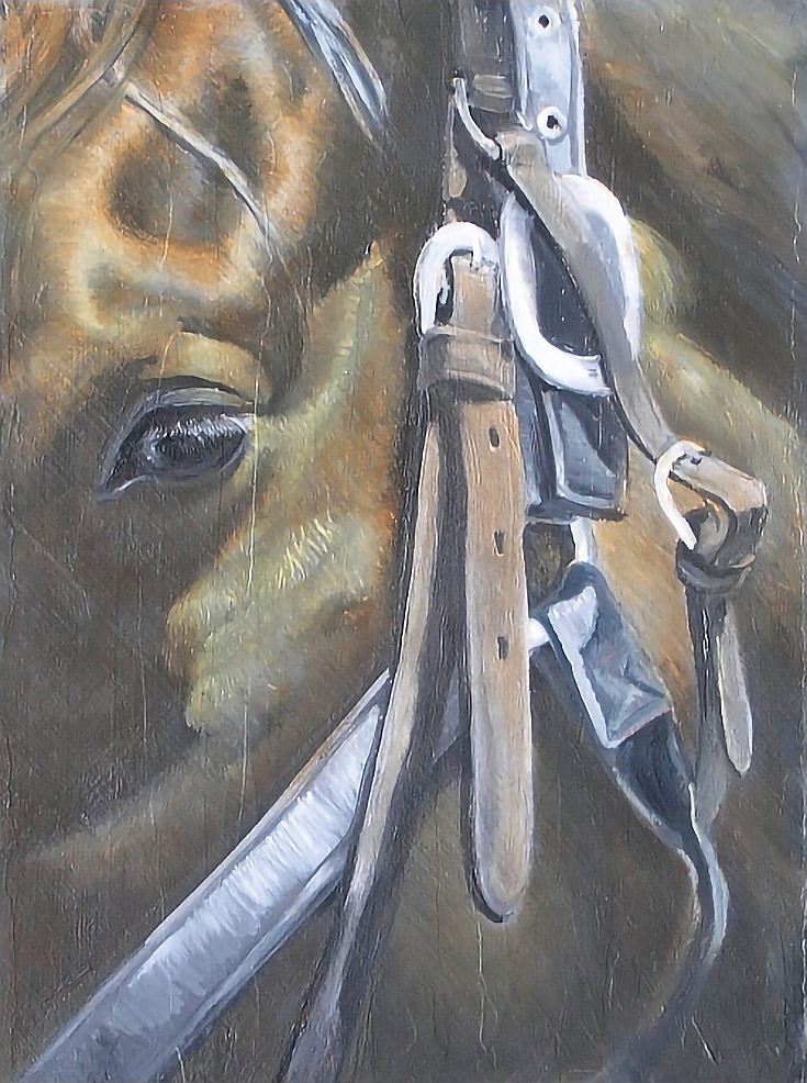
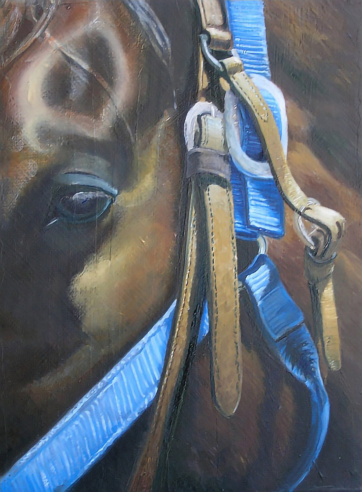
All right, let’s start painting! Here’s what mine looked like when we left off last time:
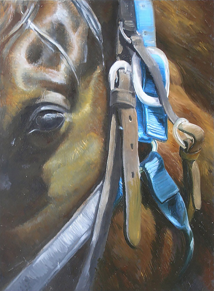
For my second color layer I started by placing the brightest highlights around the horse’s eye with a mixture of Cerulean Blue and Titanium White, but I kept the mixture dry (with no added oil or painting medium) and simply dry-brushed those opaque highlights onto the canvas. I also used that same mixture to paint highlights on the buckles and other metal parts of the halter and bridle, especially those nearest the eye.
Next, I toned the horse with Yellow Ochre in the gold areas, Burnt Sienna in the red areas, Burnt Umber in the brown areas, and Ivory Black mixed with Burnt Umber in the shadows. I darkened shadows and slowly developed color and detail in each part of the horse. These colors were applied in thin layers and blended over all of the area so they tinted previous work without covering it.
After letting that work dry to the touch, I painted the halter with Cerulean Blue and Titanium White. Shadows were painted with a mixture of Prussian Blue and transparent Red Iron Oxide. The bridle was painted with transparent Yellow Iron Oxide, Burnt Umber, and Titanium White with touches of Cerulean Blue or the blue mixture to subdue the middle tones and shadows.
NOTE: Small brushes are key throughout the Flemish painting process (especially at this stage) as a way of adding texture to the painting, so the largest brushes I used were #2 rounds, and most of the work was done using 20/0 and 10/0 sable rounds.
Once that previous work dried, I made another pass with color. Beginning with the halter, I painted each section to as high a degree of finish as was possible working wet-into-wet.
I started with a base color of Cerulean Blue and a #2 sable round. Using a 20/0 sable round, I then stroked in highlights of Cerulean Blue and Titanium White. I used a 10/0 sable round to stroke in shadows with Prussian Blue. Color was applied and manipulated in the direction of the weave as much as was possible.
I also worked around some of those areas so I could adjust the edges, softening and sharpening as necessary. I used a mixture of Burnt Umber and Prussian Blue to create the darkest shadows on the horse where necessary.
When that work was dry, I highlighted the halter with a mixture of Titanium White and Cerulean Blue, and then began painting the bridle straps, beginning with the part that disappears behind the horse’s ear. I used Yellow Ochre and Burnt Umber for the base color of the straps, and added Titanium White to lighten the mixture for highlights, along with a touch of Cerulean Blue to keep the highlights from becoming too bold.
To darken the base color, I just added Cerulean Blue and a small amount of of the green mixture from the halter. As I finished each area, I moved on to the next.
Once everything else was finished on the horse, I worked on the eye. I used Palette Gray, Burnt Umber, Prussian Blue, Yellow Ochre, and Titanium White.
NOTE: Palette gray is a gray color made by combining all your leftover colors from your painting palette after each painting session. It can be warmed or cooled as necessary by adding small amounts of Yellow Ochre or a blue or green.
Unfortunately as I began working on this section, I discovered that the angle and shape of the eye was incorrect. It’s not preferable to be making corrections at this stage and it’s not typical, either. But things do happen in the course of painting. In this case, my forward progress stopped while I corrected my errors.
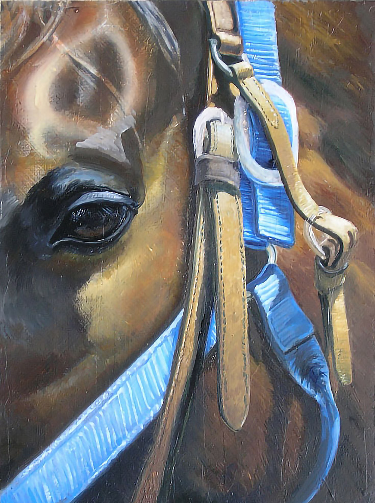
I redrew the eye with paint, then painted the necessary corrections and blended them into the rest of the painting.
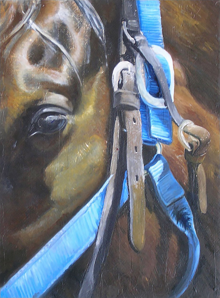
You can see that the size, visual depth, and placement of the eye is much better.
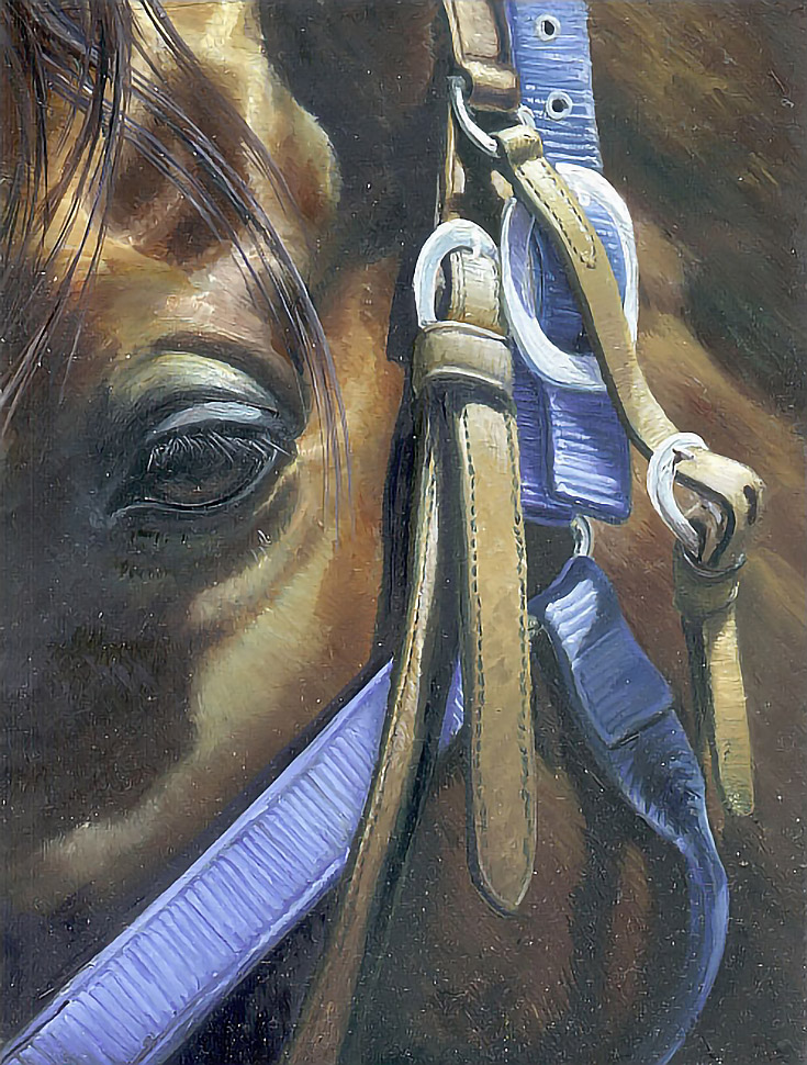
Finally, I worked throughout the painting to add more detail and texture, especially around the eye and the two large buckles nearest to it. Details such as the long hair over the eye, the eye lashes, and some reflected light on the buckles were added. I also emphasized highlights on the straps, toned down the bright blue, and deepened shadows everywhere in the painting as needed.
Throughout this process, I used transparent colors over my middle tones and shadows as much as possible. I also tried to blend my small brushstrokes in those areas and leave a smooth, even paint film.
For my highlights, I painted with thicker, less transparent paint and colors—the brighter the highlights, the more opaquely they were painted—and I didn’t worry about blending those as much.
Now that I’ve finished my second color layer, the painting is beginning to look finished. In fact, for some time, I actually considered this painting complete, and like me, you may be tempted to think you’re finished when you finish the second color layer.
But there is one more step. . . the final step. Detailing the painting.
Stay tuned for my sixth and final article on the Flemish method, coming soon in the next few weeks!
This post may contain affiliate links.
