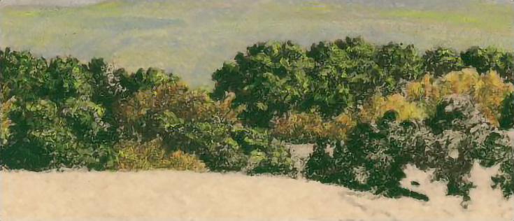
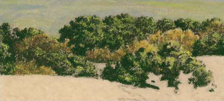
In today’s article, I want to show you step-by-step how to draw a lush forest of trees on sanded art paper.
What? Sanded art paper with colored pencils?
Yes! I realize that using colored pencils on sanded art paper might sound contradictory. After all, colored pencils are a medium designed for lots of detail, and that usually requires a very smooth surface—if there’s one thing sanded art paper isn’t, it’s smooth!
But you can draw detail on sanded art paper. I’ve drawn several landscapes on it and have been pleased with most of them. There’s a definite learning curve, but it won’t take you long to begin discovering the advantages of pairing colored pencils with sanded pastel paper for landscape drawings.
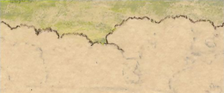
Step 1: Outline the basic shapes
Outline the trees began with light pressure with the base color of the trees (I used Prismacolor Marine Green). Outline not only the outer edges, but the inner edges between the trees and, if you wish, some of the darker shadows.
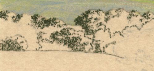
Step 2: Add darkest shadows
Use stippling strokes and medium pressure with a slightly blunted pencil to start shading in the darkest shadows. The strokes should be either dots or very short marks. Start in the trees at the very back and work forward. Use multiple layers to create darker values.
Since the trees are not a continuous belt of trees, but several “layers,” it may be helpful to outline each “layer” as you work to the front of the row. You don’t need to draw the shapes exactly, and can even draw the edges with dotted or dashed lines as I’ve done in a couple of places.
Also lightly draw the edge between the trees and the hills in front of them so you know where the trees end.
Whether you outline or not, take care to keep the shapes of the trees from becoming two regular or uniform. Don’t stress over getting everything exact.
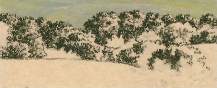
Step 3: Darken shadows and add darker middle values
Darken the dark values, and start adding some middle values. You can continue with Marine Green (as I did) or use a different green.
Use the same stippling stroke with a blunt pencil, but vary your pressure. In the darkest shadows, use medium heavy pressure or heavier. For the middle values, use medium pressure or lighter.
Don’t try to fill in the tooth of the paper. The paper isn’t the right color to act as highlights for the trees, but it will add value and interest to the trees. It will also help keep those greens from getting too bright.
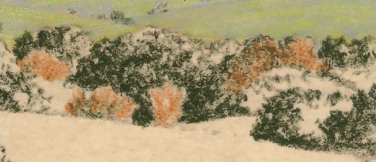
Step 4: Draw the lighter colored trees
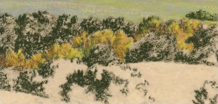
Some trees will be a lighter, yellower shade of green. Work carefully around those, as shown below.
Then, lightly layer Yellow Ochre over all of the yellowish trees. These are a different type of tree than the darker trees, so use whatever stroke helps you draw that look. Use a sharp pencil and carefully mimic the shapes and textures within these trees.
Next, layer Yellow Chartreuse over the same trees. Again, use a sharp pencil and mimic the same types of strokes. It’s not important to put Yellow Chartreuse exactly over every bit of Yellow Ochre—both colors mixing will give a more natural look.
Step 5: Unify the greens
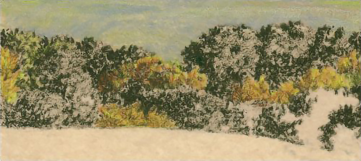
Layer Marine Green very lightly over each of the lighter trees to tint them a more realistic shade of green. Darken the shadows a little with additional Marine Green, and if you wish, soften the edges between the lighter and darker trees by shading lightly over the edges with Marine Green.
Also lightly layer Marine Green over the darker trees to darken them overall. Don’t go very dark, but even the brighter highlights in the dark trees should be darker than the background.
You can see the difference between the dark trees and the background above. Also note the difference between the dark trees in back (where I layered Marine Green) and the dark trees in front, where I haven’t yet layered additional Marine Green.
Step 6: Finish shading
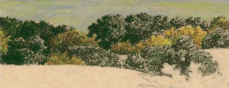
Finish shading the row of trees, working between the light and dark trees with Prismacolor Olive Green. Use light pressure to add Olive Green into the shadows on the light-colored trees.
Then use medium pressure to layer Olive Green throughout the darker trees, saving only the lightest highlights.
Finally, use heavy pressure to darken the shadows in the dark trees.
In the illustration below, the trees on the left are finished with Olive Green. They’re very dark compared to the rest of the trees. To the right are trees with the middle values darkened, and I’ve started on the shadows. The rest of the trees show only the middle values glazed with Olive Green.
Step 7: Lighten any color that gets too dark
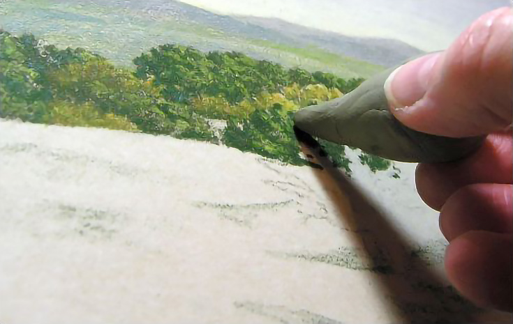
If you get any of the areas too dark, use a sticky stuff eraser shaped into a point to restore highlights. Sticky stuff can be shaped and used in an infinite number of ways. To lift color from these trees, for example, I worked the sticky stuff until it came to a narrow point.
Then I used it like a pencil, and pressed it lightly against the paper, then lifted it again.
TIP: It’s a good idea to clean the sticky stuff after each use. Sticky stuff absorbs any color it picks up. To clean it, knead it, stretch it, and fold it into itself until all picked up color disappears.
Step 8: Add highlights
Add highlights with Yellow Chartreuse. Use medium pressure and a squiggly, or stippling stroke. These type of strokes create “broken” color that looks more natural, than drawing highlights with “blocks” of color.
Also note how the color and grit of the paper contributes to the look of foliage. This isn’t something you’re likely to notice when looking at the drawing overall, but it does make a difference in the “feel” of the drawing.
Step 9: Put down your finishing touches
Continue working on the trees until they meet with your satisfaction. Don’t worry about getting them exactly right. You won’t really know whether the colors and values are correct until the rest of the drawing is finished, so don’t fuss too much.
One of the neatest things about working with colored pencil on sanded art papers is that you can layer light colors over dark almost like painting. It’s also very easy to lift color, so the paper overall is very forgiving. (Yes, even with colored pencil!)
If you haven’t ever used sanded art paper, I highly encourage you to try it out. Even if it doesn’t become your new favorite paper, I think it’s worth the experience of “painting with colored pencil!”
This post may contain affiliate links.
